Showing posts with label design. Show all posts

Monday, October 1, 2012

Remarkable

I read a great Seth Godin piece once that spoke about the need for products and services to stand out, to literally be remarkable.  That is, provoke people to say something about it.
As we look at all the marketing knobs from our top level goals down the creative and copy used in campaigns, it sure helps when what you are talking about is remarkable.

From a startup perspective, this is so critical.  Sure, you can always slap some lipstick on the pig.  What is much harder yet has much more impact is to look seriously at your product or service, the business needs, the user needs, and technology or real-world opportunities and limitations and truly improve it.

And, differentiate it in a meaningful way.

When your product is truly remarkable, it will speak for itself.

Saturday, November 19, 2011

Bad Design! Bad, Bad Design!

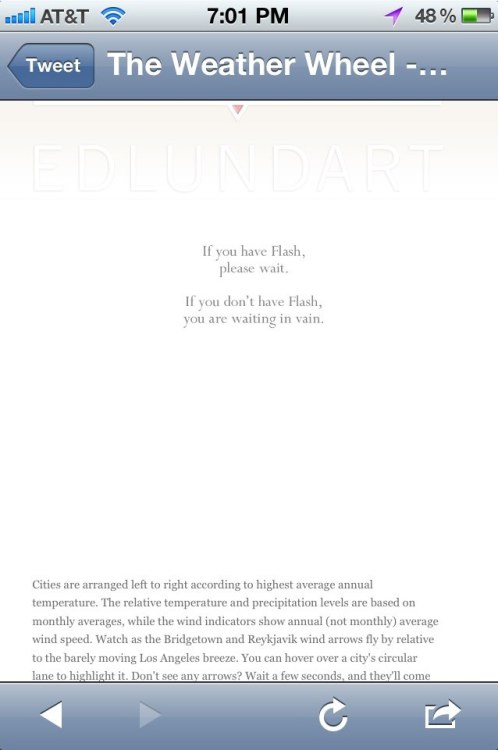
I stumbled across this website today, which points out the poorer choices in mobile web design that many have made across the Internets.  It's educational, entertaining, and just fun.  It's like the People of Walmart for nerds and designers.  Just not quite as funny.  Or shocking.


Having said that, I agree with some of the sentiment that is noted in tweets that they present, there is no mobile web, just the web.  With good, modern responsive design, companies and agencies can develop one website for most modern devices.

The Boston Globe did this and claimed a lot of notoriety for their work.  I like the way that the user experience scales down appropriately as you resize the browser window to smartphone and feature phone sizes.

It's interesting, as the questions for brands has shifted from "should I do a mobile web site" or "should I do mobile web or mobile apps" to "should I redesign my .com site to be responsive to serve all devices"?

Monday, November 14, 2011

UPDATE: It's the Screen, Stupid!

I remember when the Palm IIIc came out, Palm was on top of the handheld organizer world.  You could not imagine a day when they would not be on the top of the PDA heap.  As they moved to color screens, they focused their engineering decision on cost and low-power, while HTC, who made the COMPAQ iPAQ chose the best screen possible for their color Windows CE PDA.  Hey, it was the focus on that criteria that put them to the top, but the world was changing beneath them.

When consumer came up to the glass case at their local COMPUSA or Circuit City (you remember them, don't you?) they would see this Palm device with a washed out screen next to the iPAQ with bright, clear colors and details.  Sold.  The iPAQ did well in the market.

Motorola DROID RAZR
I was bummed yesterday when I read the review for the new Motorola DROID RAZR.  The review focuses on the poor screen chosen for this slick, new Android smartphone.  I was thinking of buying one, and I guess I still might, but we still have not learned our lessons.  For some reason, engineers get caught up with buzzwords like AMOLED (LCD screens).  I've actually seen it on commercials for one company's big screen LCD HDTV sets.  Like my mom knows AMOLED from baking powder!  C'mon, we can do better than this, people!

Consumers don't give a rodent's posterior about acronyms.  In this case, they want bright screens, vibrant colors, and sharp details.  This is supposed to be the slickest, thinnest phone.  A revered phone brand revived to revitalize the return of Motorola.  Like that alliteration, huh?  Seriously, why do all the great things to make a great phone and mess up the most visible (and, hence, the most important) part of the experience of the phone: the screen?

Unfortunately, it takes a while to make a phone, so they can't scrape off the top and put it back in the oven.  Hopefully, there is a fix already in the pipeline.

UPDATE: I went to Best Buy for 1 hour on Friday to see both the DROID RAZR and the Kindle Fire, first hand.  The Kindle Fire seemed nice in some ways, maybe a bit jerky in scrolling.  The demo unit just played videos of the web browser and apps, which was strange.  The sales person brought us a unit we could really play with and it was okay.

The DROID RAZR's screen was better than the L.A. Times article noted, but was over-saturated and the whites were not white, so they were not far off with the review.  It was extremely thin, very fast, but also quite wide and tall.  I would love the thinness, with a smaller and better quality screen, for sure.


Thursday, October 27, 2011

You, Sir, Experience

People always wax poetically about great user interface (UI), or look-and-feel.  User experience (UX) is a science, though, and I always appreciate the science behind everything.  Developing great UX is much more than just "look and feel", though, that sounds somewhat randy when I type it again and again.

It's no wonder I have no friends...
To the UX nerd, the depths of the science likely know no bound.  While Apple gets kudos for the simplicity of its design choices on the unibody MacBook Air or the iPhone 4, this excellent article today pokes at some of Apple's not so nice design choices and teaches us about skeuomorphic vs. metaphoric design choices.

In the case of application design, I believe that sometimes the most important decisions to affect the user experience are the features that are not included.  For example, Home Depot makes an extremely rich mobile application for the iPhone.  I'm not sure there is much you can not do on the app, but I wonder if there is much that you really won't do on a mobile app.  Removing that excess allows a focus on the features that have impact on their consumer's needs or their company's goals, all while freeing up valuable UI space for better creative treatments of what is most important.

In the world of mobile and mobile apps, beauty is indeed more than skin deep.

Monday, October 10, 2011

When Good Mobile Design Goes Bad

The average Joe or Josephine thinks of good design, and they think about how good something looks.  As my user experience colleagues would argue, beauty is not skin deep.  Many excellent designs are the results of tireless and maniacal focus to a tight set of goals and inherent acumen to user design that is applied to a product, from components to packaging and everything within.

When something is designed well, it appeals to you from the first look, the first touch, and every interaction you have with it through your experience.  I was reminded of great design and poor design at the same time, from the same product, this weekend.  My Sony Ericsson Bluetooth HBH-IS800 Headset.

Recently, I learned that I could link my American Express points with Amazon (awesomeness!), which has led me to buy many things that I may not have necessarily needed, including this headset.  I bought it so I could jog and listen to podcasts, without the nuisance of the cord that I occasionally yank out with my clumsy arms.  I am not beauty in motion, mind you.


So, as you can see from the photo, the headset is amazing, in that its minimal, simple, and extremely light for a stereo wireless headset.  Exactly what I needed for running.

Now, look at the power adapter.  This has been my pet peeve for years with mobile phones and laptop computers.  Electrical designers would skimp on the power design and have these massive bricks that you would need to charge the phones.  So, the phone would be thin and light, but the power brick would be just that, a brick!

Sony-Ericsson has had this particular accessory/power adaptor for at least 13 years.  Look at the sleek, simple headphones plugging into this odd adaptor.  There are multiple ways to plug it in, but only one of them is right.  The power brick is bigger and heaver than the headphones.  Looking at the two connected puts visions in my mind of a nice sports car with rims from low-cost, value car.  Ideally, this should be able to plug in to a USB port, so I would not have to bring this extra cord when I travel.

Needless to say, with good design, the experience pleases from start to finish.  There's no use having a tiny laptop with a huge power brick, unless you are promising unlimited battery life, so I can travel without compromise.  Focused goals and vision, attention to every detail, and a disciplined regimen of user experience from the beginning of the produce process to the end.